Coloring in Minimalism: Choosing Palettes that Promote Calm and Clarity
Understanding the Impact of Color in Minimalist Design
In our increasingly chaotic lives, the concept of minimalism shines like a beacon of clarity. **Choosing the right color palettes** plays a pivotal role in this design philosophy, fundamentally influencing our perception of space and mood. Colors do more than simply catch our eye; they evoke emotions and can profoundly alter our experiences. From the tranquil blue of a serene ocean to the refreshing green of a lush forest, colors can create an emotional resonance that fosters both calmness and clarity.
Let’s explore how a minimalist approach to coloring can enrich our daily lives through its numerous benefits:
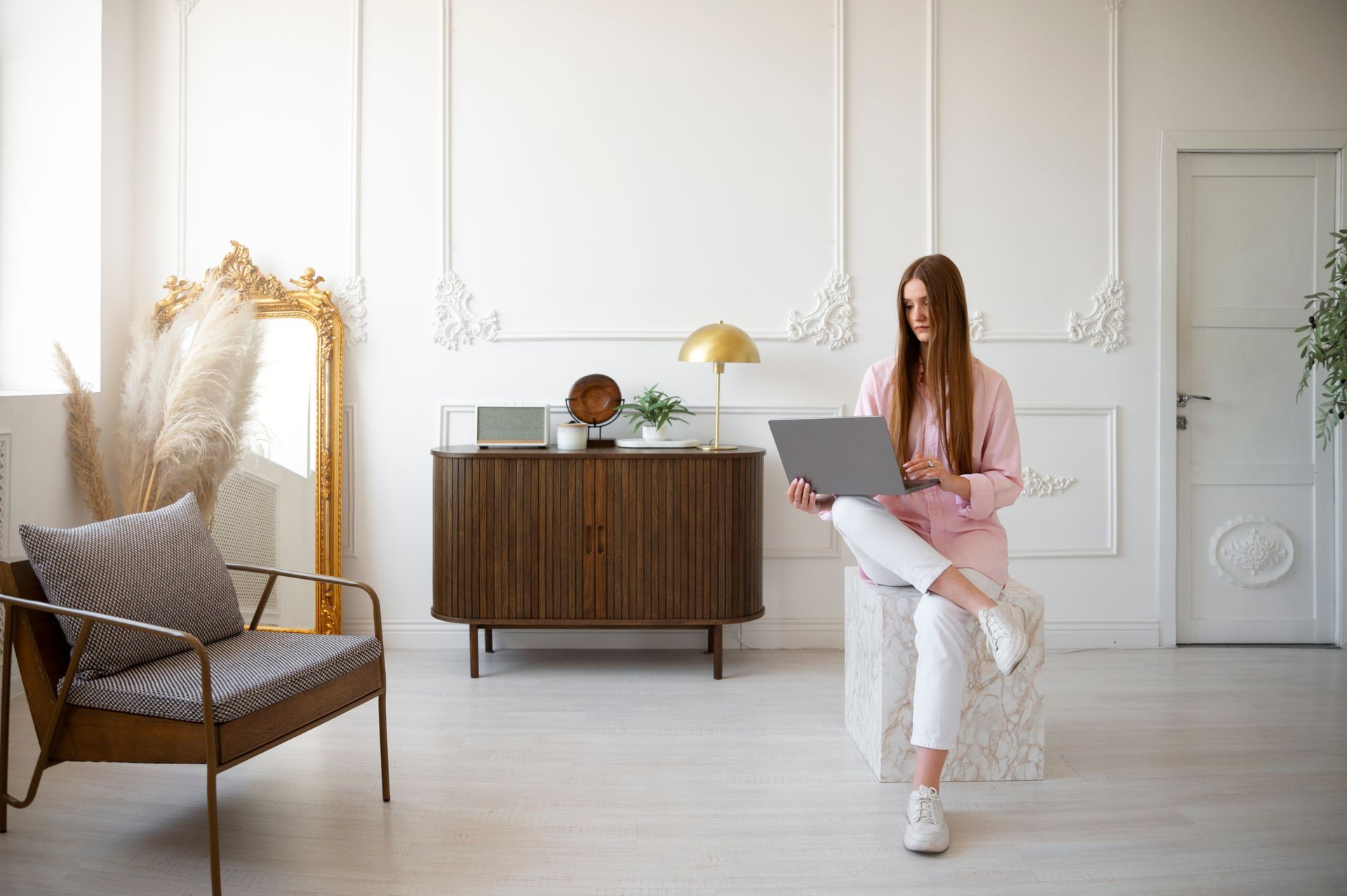
- Reduces Visual Clutter: A simplistic palette often incorporates fewer colors, creating a cohesive and harmonious look. This visual reduction helps lessen distractions, allowing the viewer to focus on what truly matters. For instance, a workspace painted in shades of white with accents of soft gray can provide an unencumbered environment where creativity thrives.
- Enhances Focus: Soft hues, such as pastel tones, are known to promote concentration. When surrounded by overstimulating bright colors, it’s easy for our minds to wander. In contrast, a calming color scheme can help sharpen attention and productivity, making them ideal for study environments or home offices.
- Creates a Calming Environment: Certain colors, including shades of blue and green, have been shown to evoke tranquility and peace. Think of the serene blue skies or calming green landscapes. Incorporating these colors into your living space can transform it into an oasis, promoting relaxation after a busy day.
The art of minimalist coloring is not merely an aesthetic choice; it is also a pathway to fostering a serene mindset. When we engage in coloring activities—whether it’s creating art, decorating spaces, or designing personal projects—our color choices matter significantly. The **essence of minimalism** extends beyond decluttering our physical spaces; it encourages a refined selection of visual elements that resonate with our emotional needs.
Intrigued by how color influences our emotional landscape? Dive deeper into the **nuances of minimalism in coloring**, exploring how we can select palettes that not only enhance our surroundings but also nurture a peaceful state of mind. By understanding the emotional tie to color, we can craft spaces and experiences that truly reflect who we are and how we wish to feel. Embrace minimalism and discover how intentional color choices can lead to a more fulfilling life.
DISCOVER MORE: Click here to learn how simplicity can transform your home

The Psychology of Color in Minimalist Spaces
To truly understand how color shapes our environments and emotions, it’s vital to delve into the psychological effects of different colors. Each color evokes particular feelings and can significantly impact our mood and behavior. In the framework of minimalism, where simplicity reigns, the selected colors need to serve a purpose, aligning with the goal of creating a peaceful atmosphere.
For instance, research has consistently shown that blue hues are particularly effective in creating a calming effect. Studies indicate that exposure to the color blue can lower heart rates and reduce feelings of anxiety. Many interior designers incorporate soft, powdery blues in bedrooms and bathrooms, as these settings benefit from a tranquil ambiance conducive to relaxation and rest.
Similarly, shades of green offer an excellent option for promoting clarity and rejuvenation. Evocative of nature, green can remind us of lush landscapes and vibrant foliage, reinforcing a connection to the outside world. Subtle green tones in living spaces can also help improve focus and stimulate decision-making, making them ideal choices for home offices and study environments.
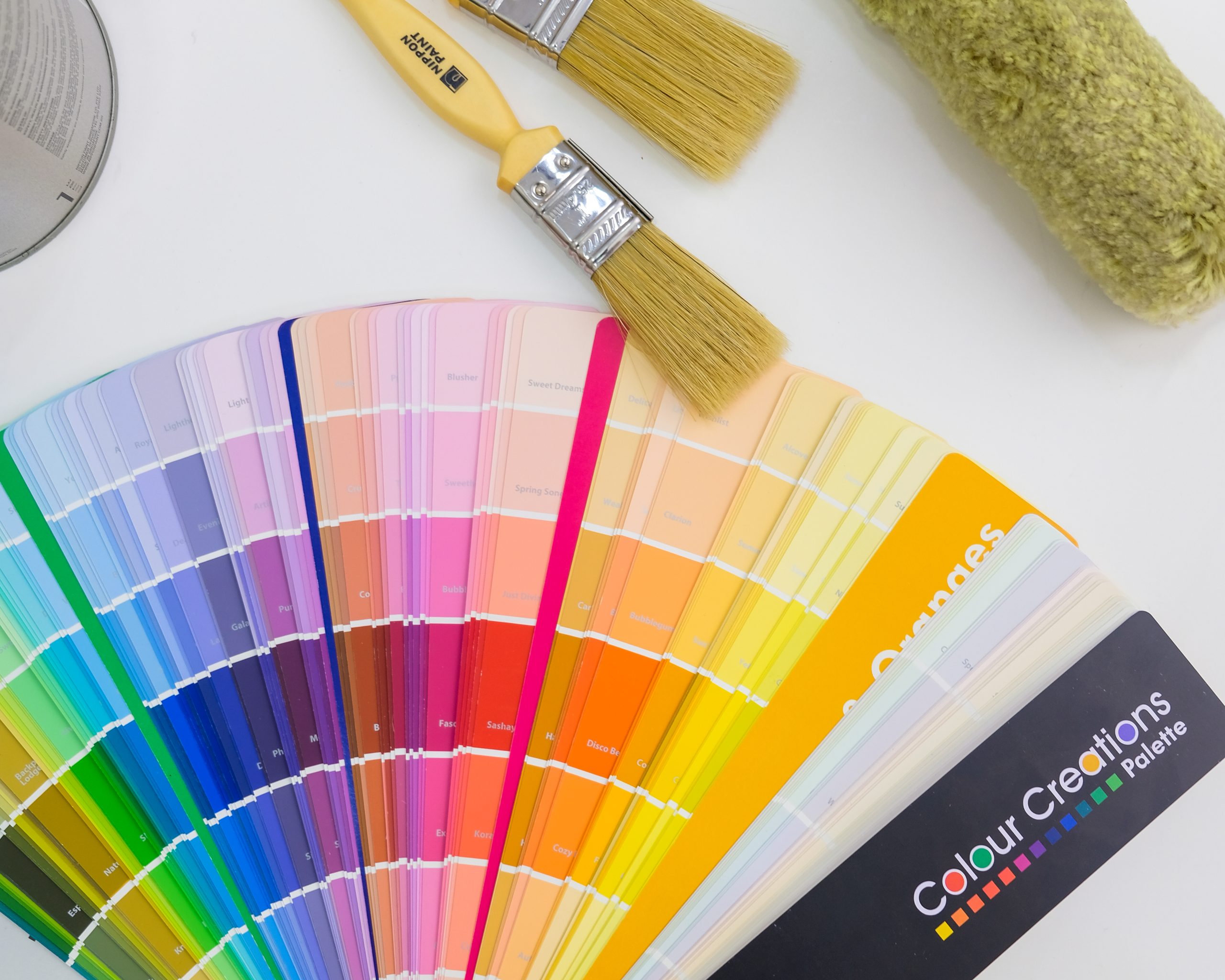
To harness the power of color effectively, consider these minimalist color palettes that can bolster your surroundings:
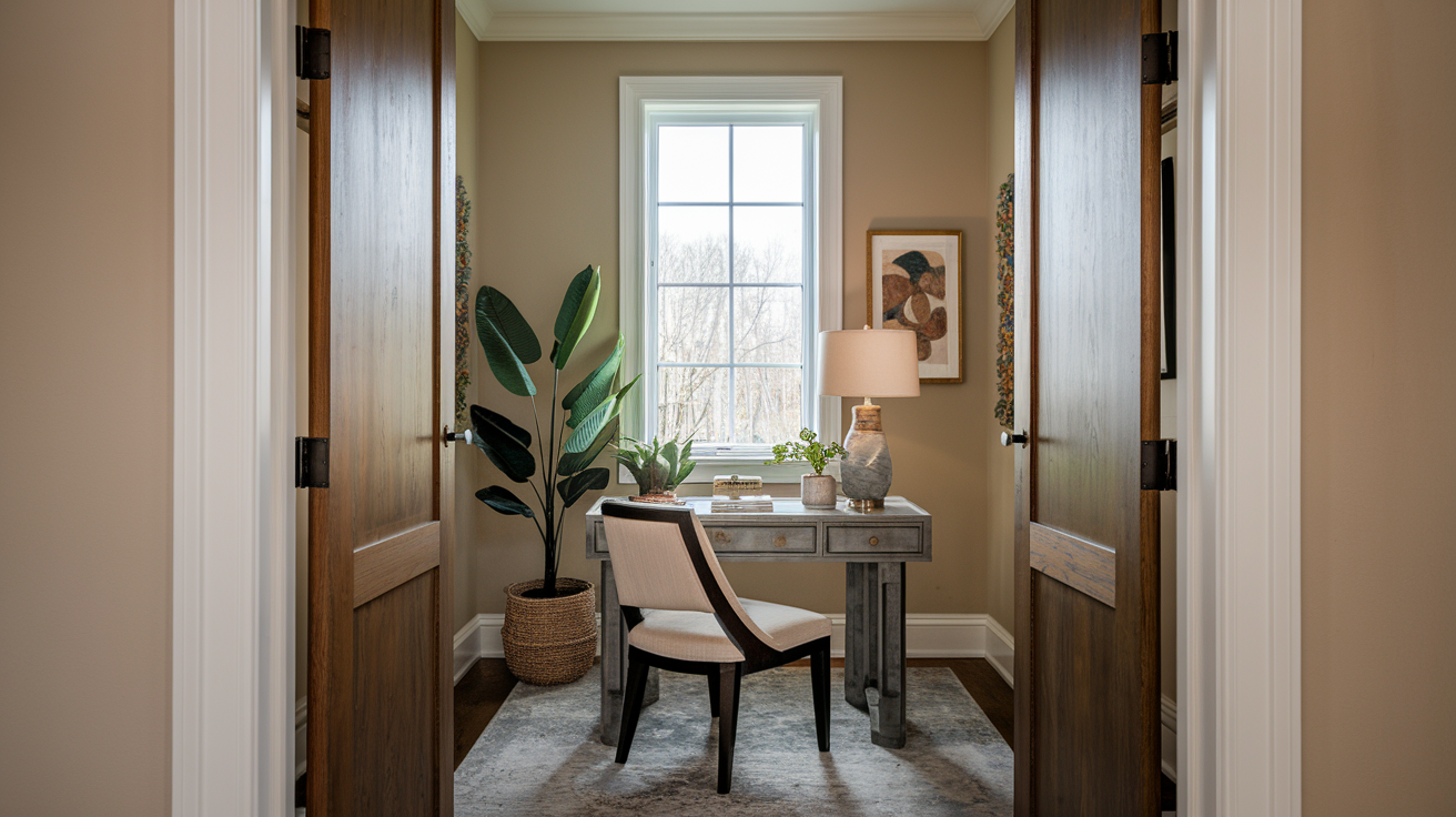
- Monochromatic Schemes: Utilizing variations of a single color, such as different depths of gray or muted blues, creates a cohesive look that fosters serenity.
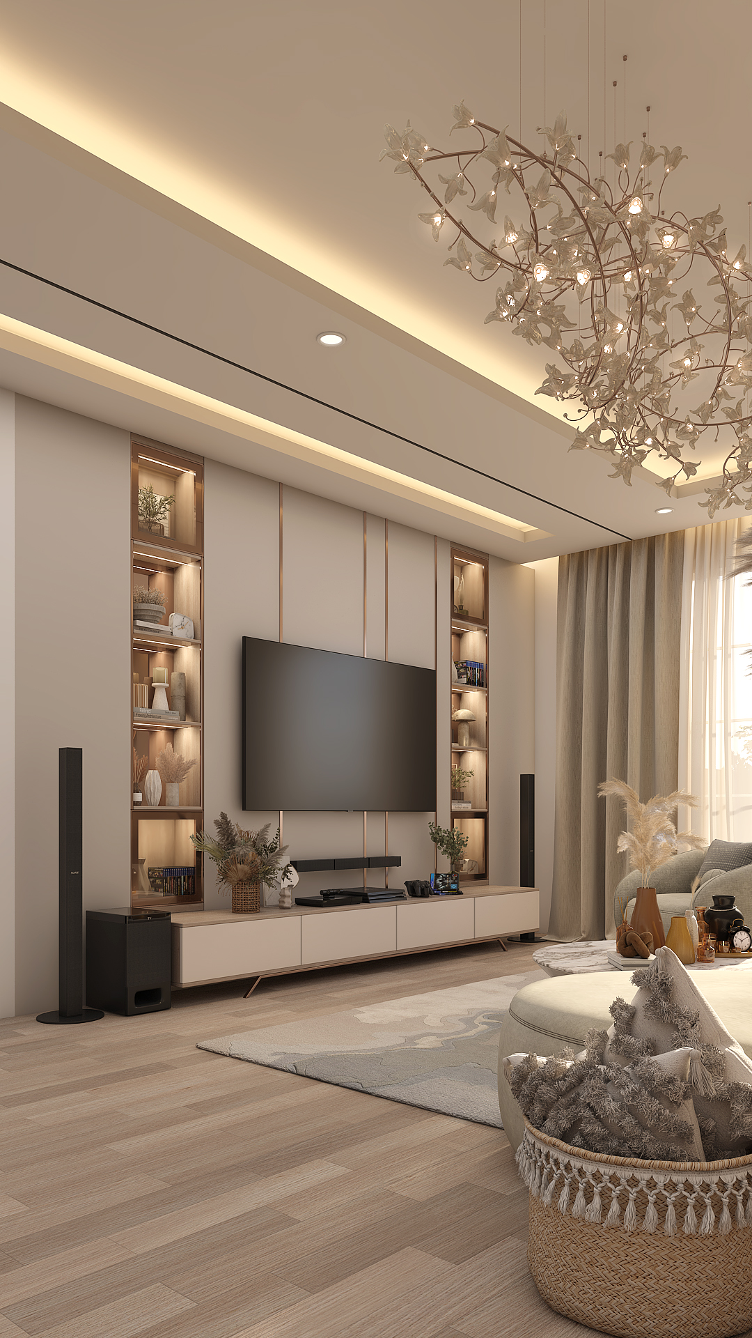
- Earthy Tones: Palettes inspired by sand, soil, and stone can ground your space, promoting stability and calm. Colors like taupe, beige, and sage evoke a sense of connection to the earth.
- Soft Pastels: Gentle tones like blush pinks, lavender, and light mint can infuse a space with creativity and openness while remaining soothing to the eye.
When selecting a palette, it’s essential to stay mindful of light and space. Natural light can alter how we perceive color, sometimes amplifying its effects or muting its vibrancy. A warm, inviting light can enhance soft hues, whereas harsh artificial lighting might distort them, leading to a potentially discordant atmosphere.
In the end, the integration of minimalism and color is about more than visual appeal; it encompasses a deeper understanding of how we want to feel within our spaces. By intentionally curating color palettes that mirror our desires for calm and clarity, we can craft retreats from the hustle of everyday life, prompting an experiential shift that resonates at both emotional and psychological levels. The journey toward minimalism through coloring is one that invites imagination and intention, offering a path to creating environments that truly reflect our values and aspirations.
Exploring the Psychological Impact of Minimalist Color Palettes
In the realm of design, particularly in how we engage with our environments, color plays a crucial role in influencing our emotional state and overall well-being. A minimalist approach to color, characterized by muted tones and harmonious combinations, can significantly enhance feelings of calm and clarity. The psychological effects of color are well-documented; for instance, shades of blue and green are often associated with tranquility and mental clarity. These hues can create spaces that invite relaxation and contemplation, making them ideal choices for serene settings.Moreover, implementing pastel palettes or earthy tones can further cultivate a sense of stability and peace. By limiting color choices, designers foster an environment where the mind is less cluttered, allowing individuals to focus better and feel more present. This intentionally curated simplicity leads to heightened creativity and productivity, as the calming backdrop enables clear thought processes.
Practical Tips for Implementing Calm Color Schemes
To create a soothing atmosphere in your living or working space, start with a color palette that includes soft, subdued colors. Options like light greys, whispering whites, and gentle pastels not only maintain a minimalistic aesthetic but also promote emotional well-being. Consider the psychology behind each color; for example, the use of pale blue can lower blood pressure and reduce stress.When selecting colors for different areas, think about their intended functions. A workspace might benefit from greens to inspire growth and focus, while relaxation areas could be enriched with soft pinks or muted earth tones for warmth and safety. By thoughtfully integrating these colors, you create spaces that are visually appealing while encouraging a calm and clear-minded lifestyle.
| Category | Advantages |
|---|---|
| Psychological Effects | Promotes relaxation and clarity, enhancing overall well-being through harmonious color choices. |
| Practical Implementation | Utilizing soft hues aids in creating spaces that are conducive to focus and tranquility. |
Implementing a minimalist color palette not only beautifies spaces but also aligns with the growing trend of mindfulness in our daily lives. This thoughtful approach supports mental wellness while promoting an aesthetic that resonates with many people seeking simplicity and peace. Through careful selection of colors, we can cultivate environments that truly reflect a balance of style and emotional clarity.
DISCOVER MORE: Click here to learn how simplicity can transform your space
Embracing Neutrals and Their Impact on Minimalist Design
While vibrant colors undeniably hold captivating qualities, embracing a more subtle palette through neutral tones can significantly enhance the minimalist experience. Often regarded as the backbone of minimalist design, neutral colors such as white, gray, and beige serve to create an unobtrusive backdrop that allows architectural features and furnishings to take center stage. These colors can evoke a profound sense of space, breathing life into areas that may otherwise feel cramped or chaotic.
According to leading interior design experts, light shades of white and off-white can reflect natural light, making a space feel airy and open. This sends a message of tranquility, pushing the mind towards a state of clarity. Employing an all-white palette can also foster feelings of simplicity and purity, aligning with the minimalist ethos of “less is more.” However, it is crucial to incorporate textures — consider matte finishes or rough-textured walls — which can prevent a cold or sterile feeling, making the environment feel welcoming instead.
Building Depth with Layered Neutrals
For those looking to introduce dimension without straying from a minimalist vision, layering different neutral tones can create visually appealing contrast. For instance, pairing warm beige with cooler shades of gray adds intrigue without overwhelming the senses. To further enhance this layered look, materials like natural wood, soft textiles, and stone can introduce warmth and tactile layers, making spaces more inviting even within a muted color range.
To effectively employ neutrals in your design, consider utilizing varying saturation levels of the same base hue. A room adorned with the soft glow of ivory paired with taupe accents can produce a harmonious effect that invites relaxation. Not only do neutral palettes act as a serene backdrop, but they can also serve to highlight essential decor elements or artwork, ensuring that even simple pieces stand out against their subdued surroundings.
The Role of Accents in Minimalist Color Schemes
While the foundation of a minimalist palette often rests on neutral shades, introducing accent colors can be a powerful way to foster emotional connection and energy within a space. Accentuating a room with intentional pops of color, whether through artwork, cushions, or decorative objects, can stimulate creativity without overwhelming the senses. For example, a bright mustard yellow or a deep navy blue can invigorate an otherwise neutral space, drawing the eye and providing focal points that encourage movement and conversation.
Psychologists suggest that the strategic use of color can affect our productivity and overall mood; thus, choosing just a few thoughtfully selected accent colors can enhance the environment while supporting the minimalist ideal of simplicity. When feeling overwhelmed with choices, consider starting with a color wheel to identify hues that resonate with your personal aesthetics and desired emotional outcomes. Furthermore, keeping accent colors limited in number helps maintain focus, in line with the minimalist principle of clarity.
In conclusion, an appreciation for the interplay of lights and shadows, neutrals and accents, can open up unexplored avenues for creating calming spaces. The strategic selection of colors has the potential to define and redefine spaces in ways that contribute to both aesthetic and psychological well-being, allowing the essence of minimalism to flourish through thoughtful coloring practices.
DISCOVER MORE: Click here to learn about minimalist design
Conclusion: The Art of Coloring in Minimalism
In the pursuit of a minimalist aesthetic, the careful selection of colors plays a pivotal role in fostering environments that promote calm and clarity. By embracing a palette centered around neutral tones, homeowners and designers alike can create serene backdrops that highlight architectural beauty and enhance the feeling of spaciousness. These muted hues, when expertly layered, can breathe warmth and depth into a space, proving that simplicity carries its own profound elegance.
Moreover, the judicious use of accent colors injects personality and vibrancy into minimalist designs, encouraging emotional connections without overwhelming visuals. The thoughtful balance of neutrals and accents not only reflects the core minimalist principle of “less is more,” but also reinforces a sense of calm, catering to both visual appeal and psychological well-being. As research suggests, specific colors can significantly affect our mood and productivity, making the careful choice of shades paramount in designing our living spaces.
Ultimately, coloring in minimalism opens doorways to tranquility and clarity within our environments. By embracing the principles outlined in this article, individuals can explore how their color choices impact their daily lives. As you embark on your design journey, consider experimenting with neutrals and select accents that resonate with your spirit, transforming your surroundings into a harmonious sanctuary that invites relaxation and inspires creativity.